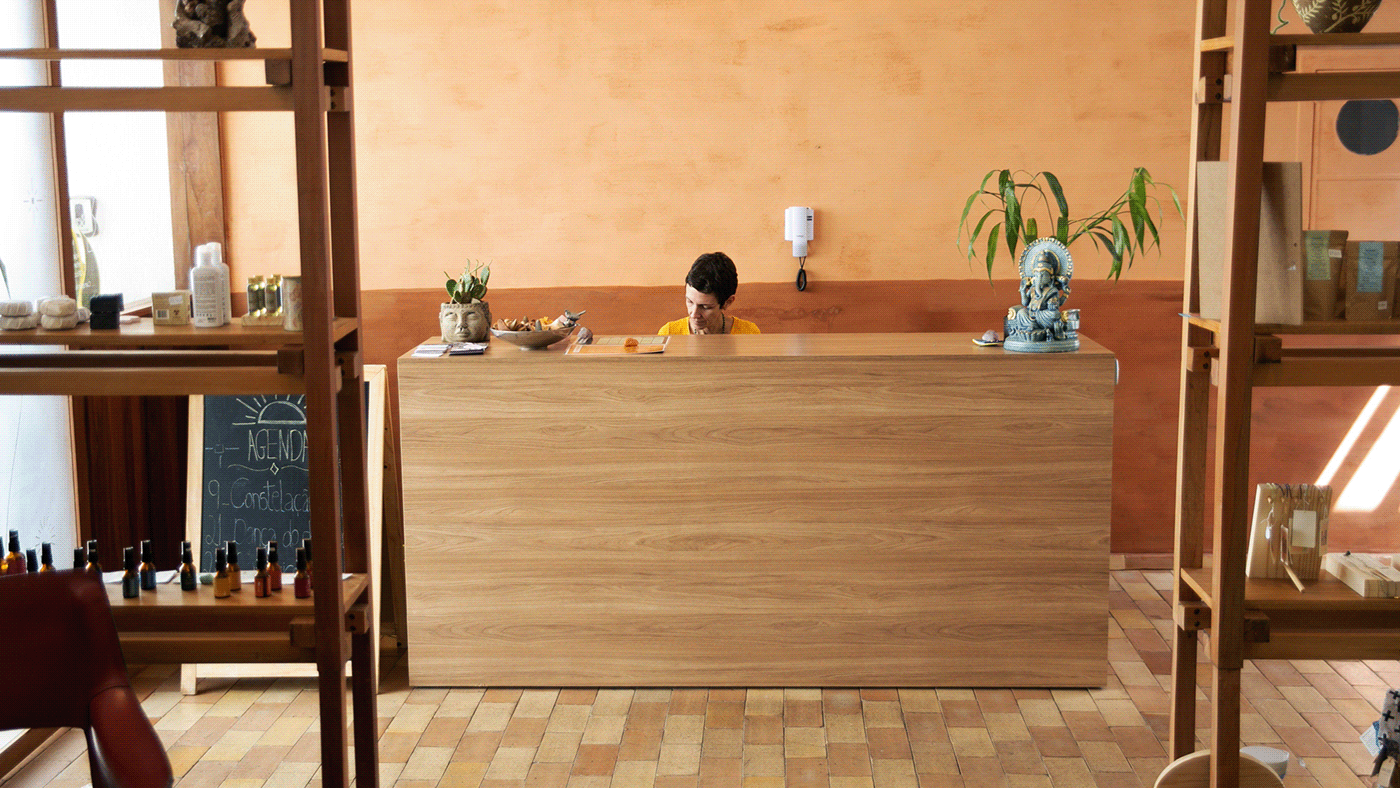
Casa Sagarana, Yoga & Therapy.
A multifaceted venue dedicated to the development and growth of individuals through connection. A homey setting where you can feel at ease and free to express your unique personality while enjoying tea, meditation, yoga, massages, courses, and other activities.

Branding, visual identity and illustration.
Belo Horizonte, Minas Gerais. 2020.
The goal was to develop a brand and visual identity that overcame segment cliches and caricatures, such as mandalas and other appropriations of mystical cultural elements. The objective was to give the brand authority, contemporaneity, maturity, and softness.
Body movement, physical space and connection were the core elements of the visual identity components. Twisting and extrusion of geometrical shapes were used to connect those experiences. These forms bring a diverse and dynamic identity that communicates Casa Sagarana's different fields of activity.
Client: Camila Barcelos
Designers: Eduardo Ouvido and Gustavo Machado
Photos: Oswaldo Castro, Pedro Haruf & Rafael Sandim.
Designers: Eduardo Ouvido and Gustavo Machado
Photos: Oswaldo Castro, Pedro Haruf & Rafael Sandim.

Type breathing


Rational typography adds strength, contrast, and clarity to logo development. To reinforce the brand image, it was used geometric shapes, suggesting movement and physical activity.
.


Body flexibility


.


.


